When analyzing numbers, the current trend that has been happening for some time is to create some form of data visualization. Charts is one way to quickly make sense of the numbers and to spot anomalies or trends. However, when using charts, you got to pick the right ones or else the data can be as confusing as the dataset.
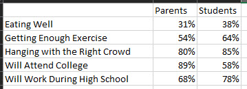
Let’s take an example to showcase a point. Say that a school took a survey of parents’ perspectives versus students’. The dataset below shows the aggregated results.

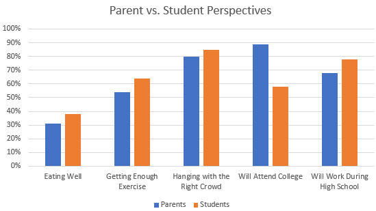
Usually, when comparing two different groups of data, people tend to use a bar chart like the one below:

But, is this the best chart to use? How do we know what is the best? Remember, the goal is to find a pattern or anomaly in the dataset. Using a bar chart, there doesn’t seem to be one. However, if we understand that different graph types have their specific purposes, we can consider using a slope graph. Why?
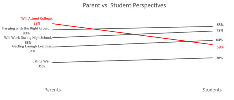
A slope graph can distinctively show change between 2 groups without the clutter of unnecessary information. Below is a slope graph of the same dataset.

This graph clearly shows a couple of anomalies. First, while every other survey point indicates students are more positive than parents, the point “will attend college” is negative. Second, the difference between each survey point is less than 10%, “will attend college” difference is greater than 30%!
Finding differences can be more easily done if you are using the right chart. Make slope graph another tool in your data visualization tool box.

